Sometimes you’ll look at a Photoshop montage and feel something isn’t quite right. You may not spot the error, but there will be a general feeling of unease.
In these examples, I’ve adjusted artwork readers have submitted to the Friday Challenge section in the How to Cheat in Photoshop Reader Forum to suggest possible fixes.
Roll over each image to see the fixed version.
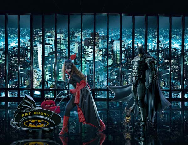
Eyes on the horizon
With the horizon as high as this, the viewer is looking down on the scene. But Batman should be at least as tall as us, if not taller. The solution: move the scene through the window down so that the horizon lines up with Batman’s eye line.
Watch a 2-minute video on why it’s important to place eyes on the horizon.
Image by DavidMac, from this Friday Challenge.

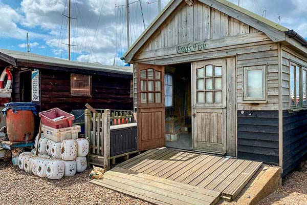
Shadows on the ground
As objects move further away from us they appear smaller, right? But the sun is nearly an infinite distance away, so the shadows it casts need to be uniform in size. In this example, the shadow of the opened door is tapered in the original submission; but it should be straight, with parallel sides.
Watch a 2-minute video on making shadows.
Image by Nick Curtain, from this Friday Challenge.

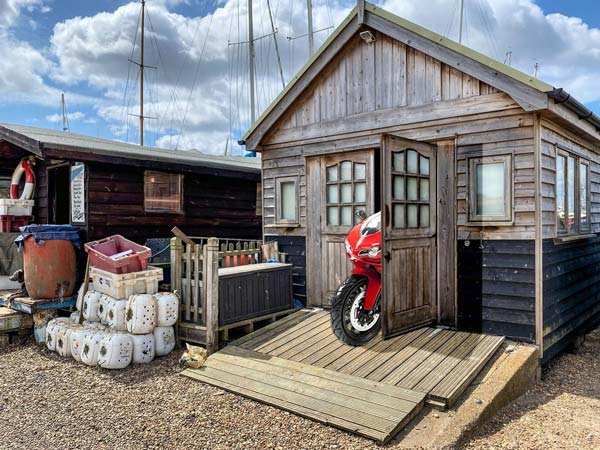
Opening the door
This entry in the same Friday Challenge as above shows the right hand door opened. But in the original view of the door, we were viewing the glazed panels from the right; now it’s open, we’re viewing them from the left. The reveals on the glazing bars are facing the wrong way. Simple solution: flip the glazed panel horizontally.
Watch a 2-minute video on how to open doors.
Image by lwc, from this Friday Challenge.

Adding reflections
This conversion of a New York taxi into a gondola works well, and the addition of the gondolier is a nice touch. But since the surrounding buildings are reflected in the water, it’s odd that the taxi doesn’t have a reflection as well. Easy to fix.
Watch a 2-minute video on how to create reflections.
Image by Jim H, from this Friday Challenge.


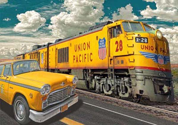
Trouble with perspective
In this Friday Challenge entry the cab and the train appear at very different angles. But as they’re racing each other, and are therefore parallel, their perspectives should match. I used Photoshop’s Perspective Warp tool to adjust the angles of view (with a fair amount of patching afterwards).
Watch a 2-minute video on how to use Perspective Warp.
Image by Michael Sinclair, from this Friday Challenge.

Put glass in your windows
This royal train carriage shows a back view of Queen Elizabeth looking at her late husband, following an incident when he was involved in a car crash. It was a neatly topical Challenge entry, but that window really needs some glass in it. A simple low opacity reflection is all that’s needed here.
Watch a 2-minute video on how to glaze windows.
Image by DavidMac, from this Friday Challenge.


A question of scale
In this beautiful image, the piano that was the subject of this Friday Challenge has been placed in a highly appropriate room with excellent lighting and shadows. But why does the scene feel uncomfortable? The piano, that close to the viewer, needs to be larger. And while we’re at it, let’s turn the piano stool round the right way.
Image by Mariner, from this Friday Challenge.


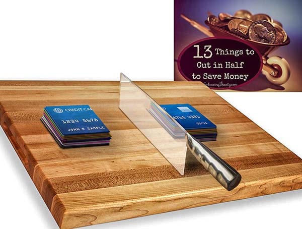
Correct reflections
The original Friday Challenge here concerned half a kettle, and I asked what else could justifiably be cut in half. This is an ingenious entry – but why is the reflected chopping board at an angle? The blade is perpendicular to the board, so the reflection should appear as if it continues through the knife. And we really should see the reflection of those cards as well.
Image by Frank, from this Friday Challenge.

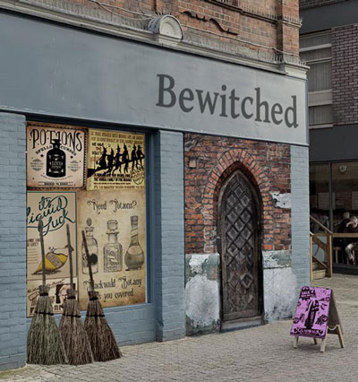
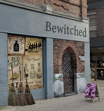
Angle of view
A neatly constructed shop front, with a medieval doorway inserted over the original door. But the new doorway had been photographed head on; when viewed from an angle, the three-dimensional nature of the recessed door needs to be taken into account.
Image by Josephine Harvatt, from this Friday Challenge.
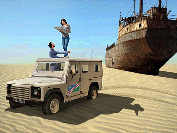
Wheels in the sand
A jeep in the desert – with a neatly made shadow. But the shadow needs to undulate over the ripples in the sand. Also, the hard line of those wheels looks unnatural; much better to make the sand look like real sand, sprayed up over the tyres.
Watch a 2-minute video on how to blend objects into a soft surface.
Image by Mariner, from this Friday Challenge.

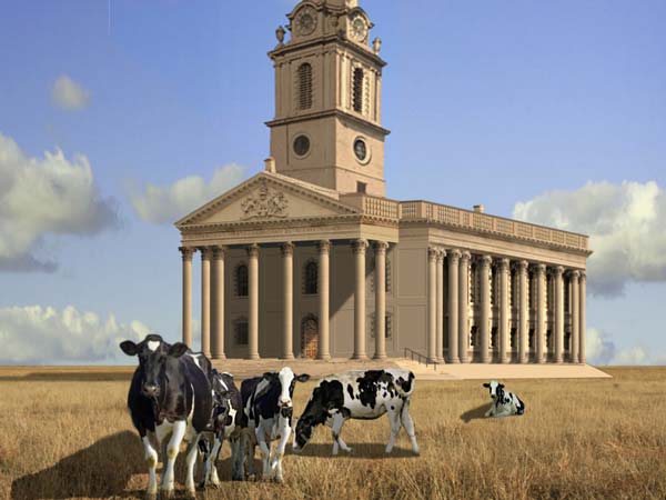
A slight perspective issue
This Friday Challenge asked readers to relocate the London church of St Martin’s in the Fields, which now appears in Trafalgar Square. The cows here add a real sense of scale and distance – but is that tower at the right angle?
Image by Mariner, from this Friday Challenge.

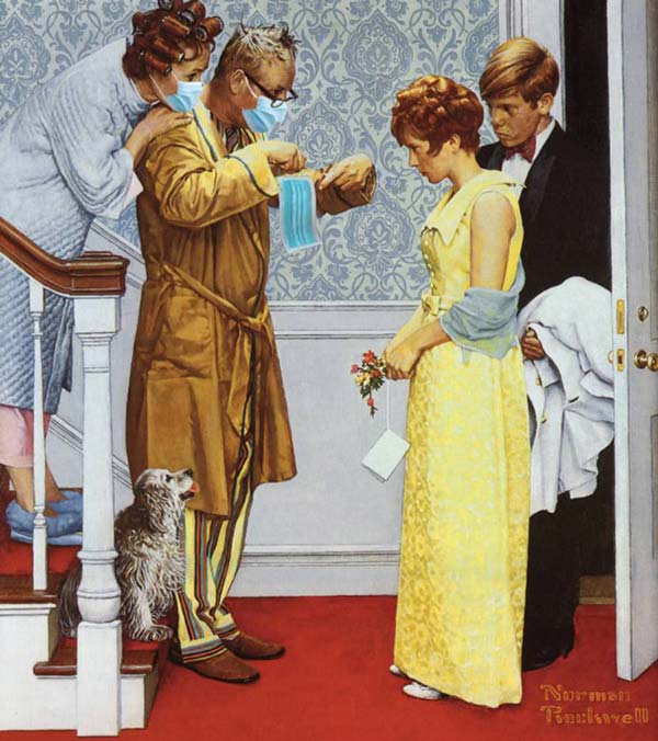
A slight curl
This Friday Challenge asked readers to add social distancing elements to works of art. The masks on the faces of the parents in this Norman Rockwell scene fit perfectly (note how the father’s mask has been slipped under his glasses). But the mask he’s holding is very stiff. A slight wave, using the Image Warp transformation, is all it takes to make the fabric look more realistic.
Watch a 2-minute video on how to use Image Warp.
Image by Vibeke, from this Friday Challenge.

Height changes perspective
A row of identical houses, made to look different by lighting up some of the windows. And the house on the hill adds interest, standing up from the rest of the street. But when the building is moved up there, the perspective needs to follow the line set by the other houses.
Image by DougD, from this Friday Challenge.

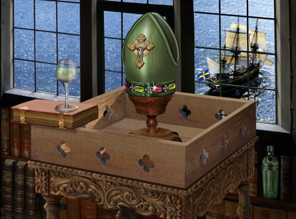
Devil in the detail
An artfully constructed scene, with plenty of interest. But there are two minor issues: the tops of the three books bottom left should be following the perspective angle as set by the top of the wooden box; and the bottle of gin, bottom right, has been photographed head on – but as we’re looking down on it, we should be able to see a curvature in the bottle, as well as the top of the cap.
Image by Mariner, from this Friday Challenge.